

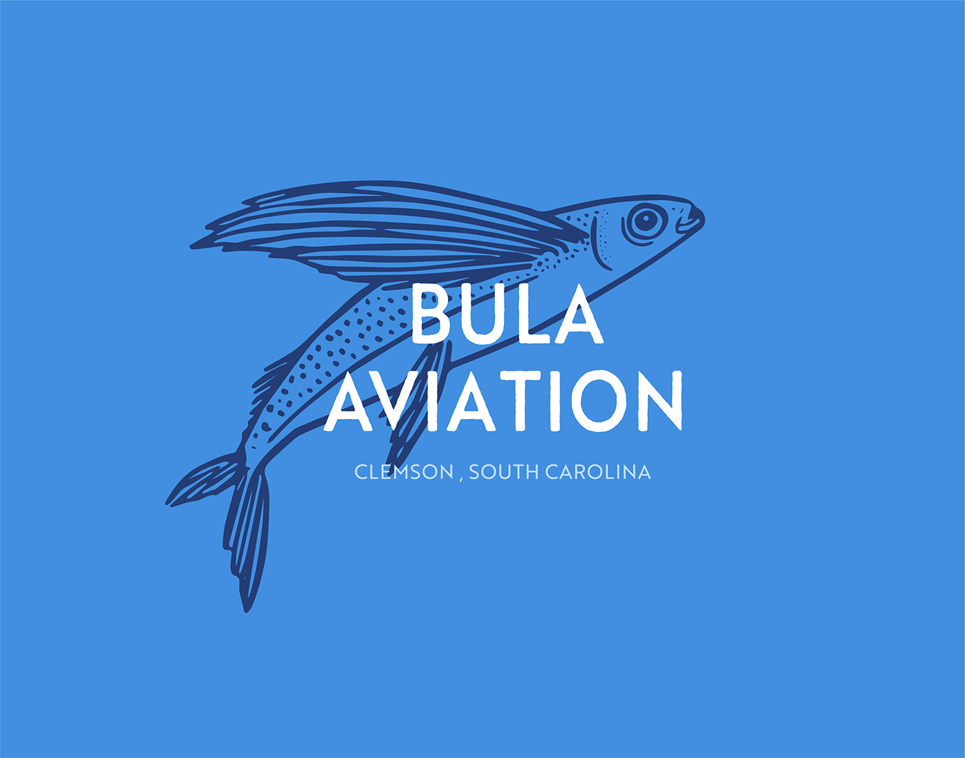
Bula Aviation is a passion project of a life long learner & admirer of all things aviation. Inspired by his childhood growing up in Aruba, the pilot wanted to use a flying fish that is commonly found in Aruba as a key element in the logo (the illustration was provided, I made a few adjustments to balance the weight).
I chose Brother 1816 as the primary typeface for its precise points (to refer to the sharpness of mind required in aviation) & the textured edges (provides a beach-y feel, tying back to the beaches of Aruba).
The bright blue was chosen as a reference to a bright cloudless blue sky, but also represents the main color of the Aruban flag. Darker & lighter blue colors were chosen as accent colors to keep things clean & classic.


